Study Notes
Overview
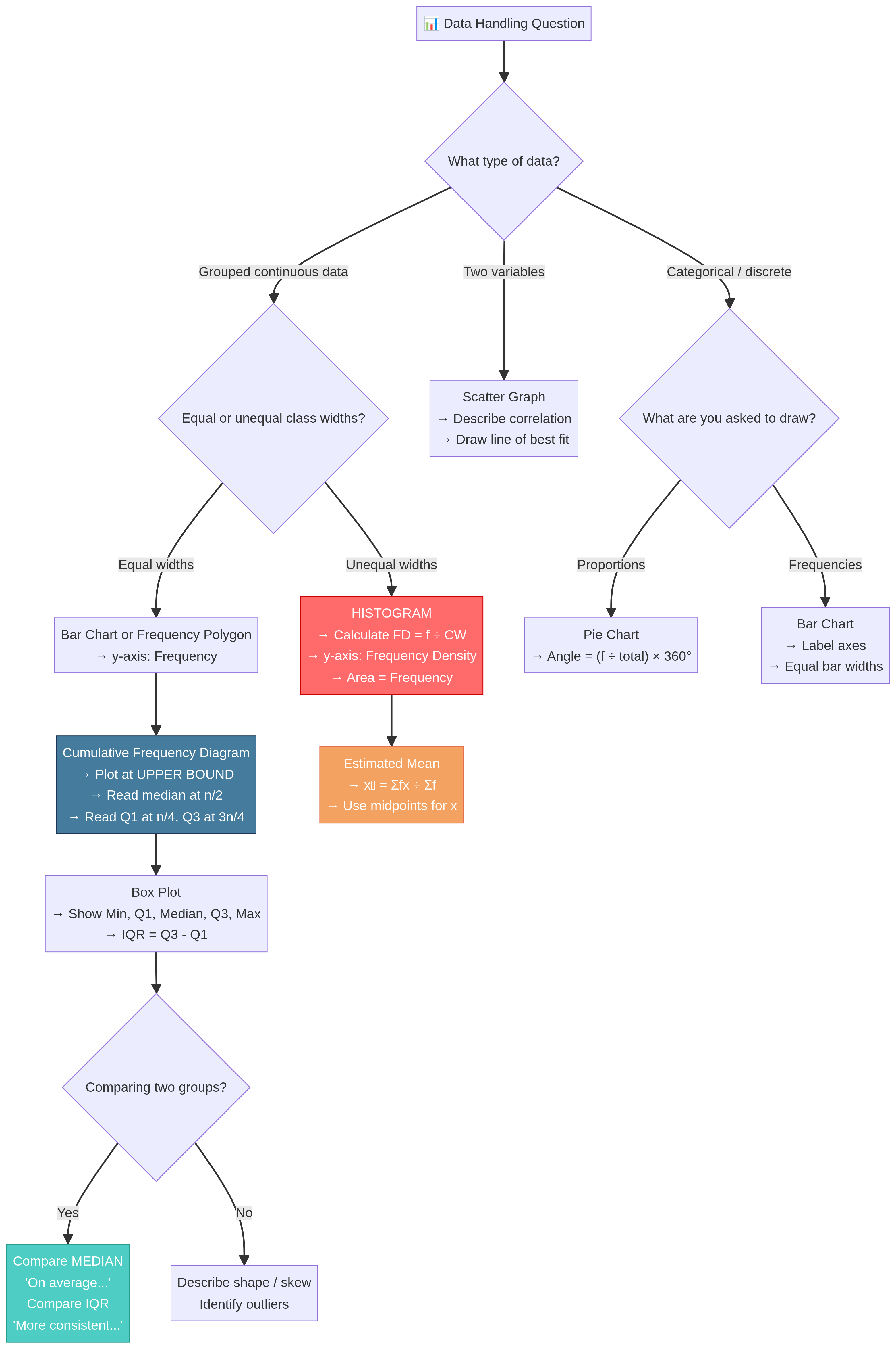
Data Handling is the art and science of telling a story with numbers. In your OCR GCSE Mathematics exam, this topic (specification reference 4.1) tests your ability to not only construct accurate statistical diagrams but, more importantly, to critically interpret and compare them. It’s a cornerstone of the syllabus because it bridges pure calculation with real-world reasoning, a skill highly valued by examiners. For Foundation candidates, this means mastering bar charts, pie charts, and averages. For Higher candidates, it demands a sophisticated understanding of histograms with unequal class widths, cumulative frequency, and comparative analysis using box plots. Questions often appear as multi-part, data-heavy problems, requiring you to switch between calculation, plotting, and written explanation. Strong performance here demonstrates a well-rounded mathematical ability, linking directly to topics like probability, percentages, and algebraic formulas.
Key Concepts
Concept 1: Averages and Measures of Spread
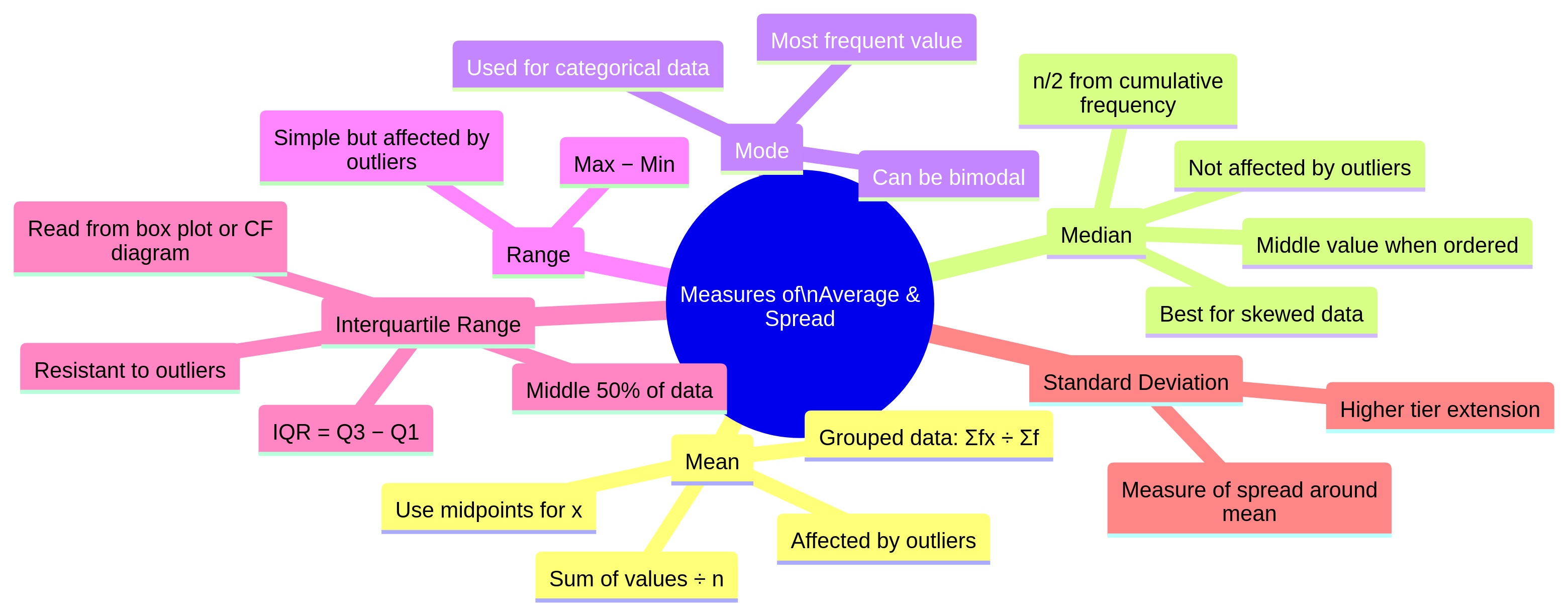
At its core, data handling is about summarising a set of data. We use averages (or measures of central tendency) to find a typical value, and measures of spread to understand how consistent or varied the data is.
- Mean: The sum of all values divided by the number of values. It's the most common average but can be skewed by unusually high or low values (outliers).
- Median: The middle value when all data points are arranged in order. It is resistant to outliers, making it a better choice for skewed data.
- Mode: The most frequent value. It's the only average that can be used for non-numerical (categorical) data.
- Range: The difference between the highest and lowest values. It's a simple measure of spread but is highly affected by outliers.
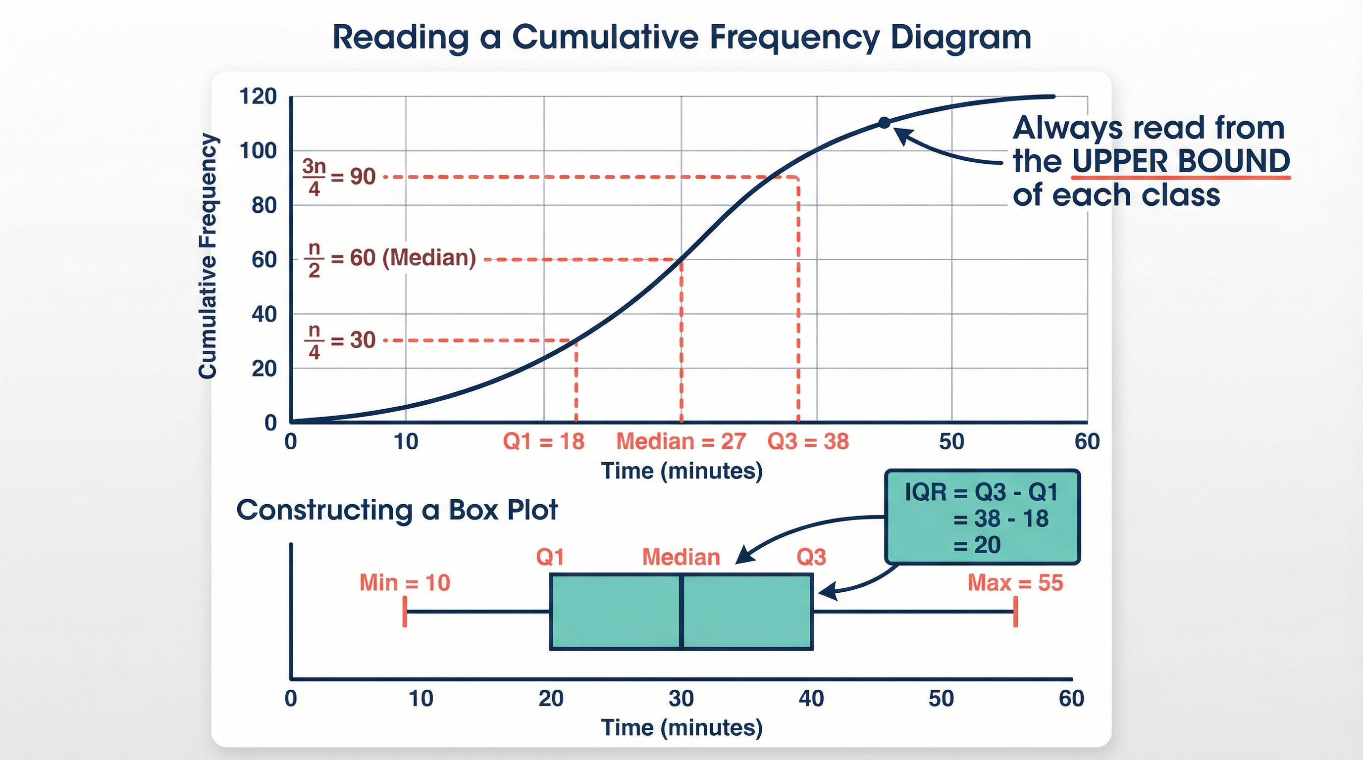
- Interquartile Range (IQR): The difference between the upper quartile (Q3) and the lower quartile (Q1). It shows the spread of the middle 50% of the data and is not affected by outliers, making it a more robust measure of spread than the range.
Concept 2: Representing Data (Foundation & Higher)
Visual representation is key. You must be able to both draw and interpret several types of diagrams.
- Bar Charts: Used for discrete or categorical data. The height of the bar represents the frequency. Ensure all bars are of equal width and have gaps between them.
- Pie Charts: Used to show proportions. The whole circle represents the total frequency (360°). To find the angle for a category, use the formula:
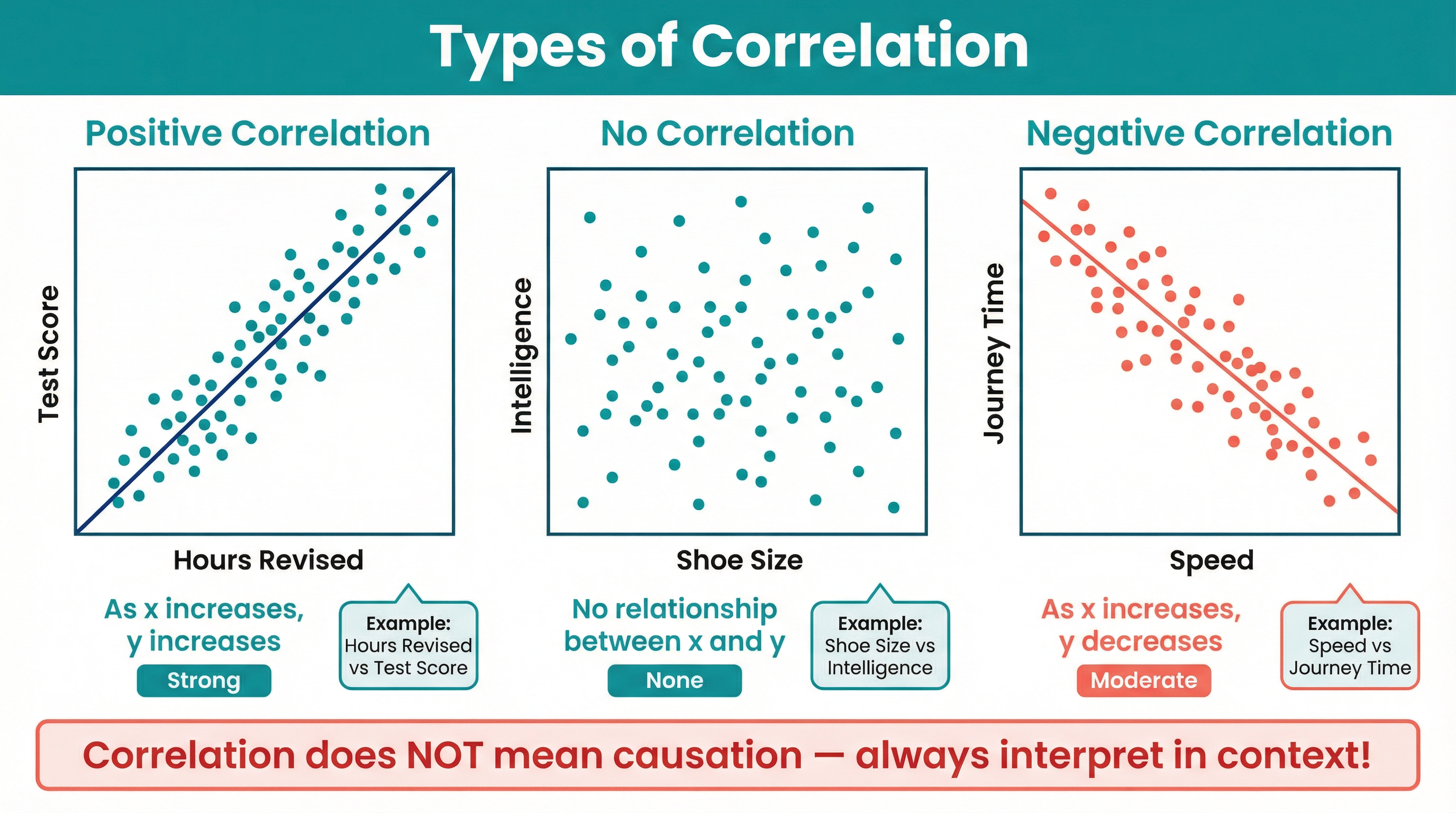
(Frequency / Total Frequency) * 360. - Scatter Graphs: Used to show the relationship (correlation) between two continuous variables. By observing the pattern of points, you can determine if the correlation is positive, negative, or non-existent. A 'line of best fit' can be drawn to approximate the trend, which can then be used for interpolation (estimating within the data range) or extrapolation (estimating outside the data range - be careful, this can be unreliable!).
Concept 3: Advanced Representation (Higher Tier Only)
For Higher tier candidates, the level of sophistication increases significantly.
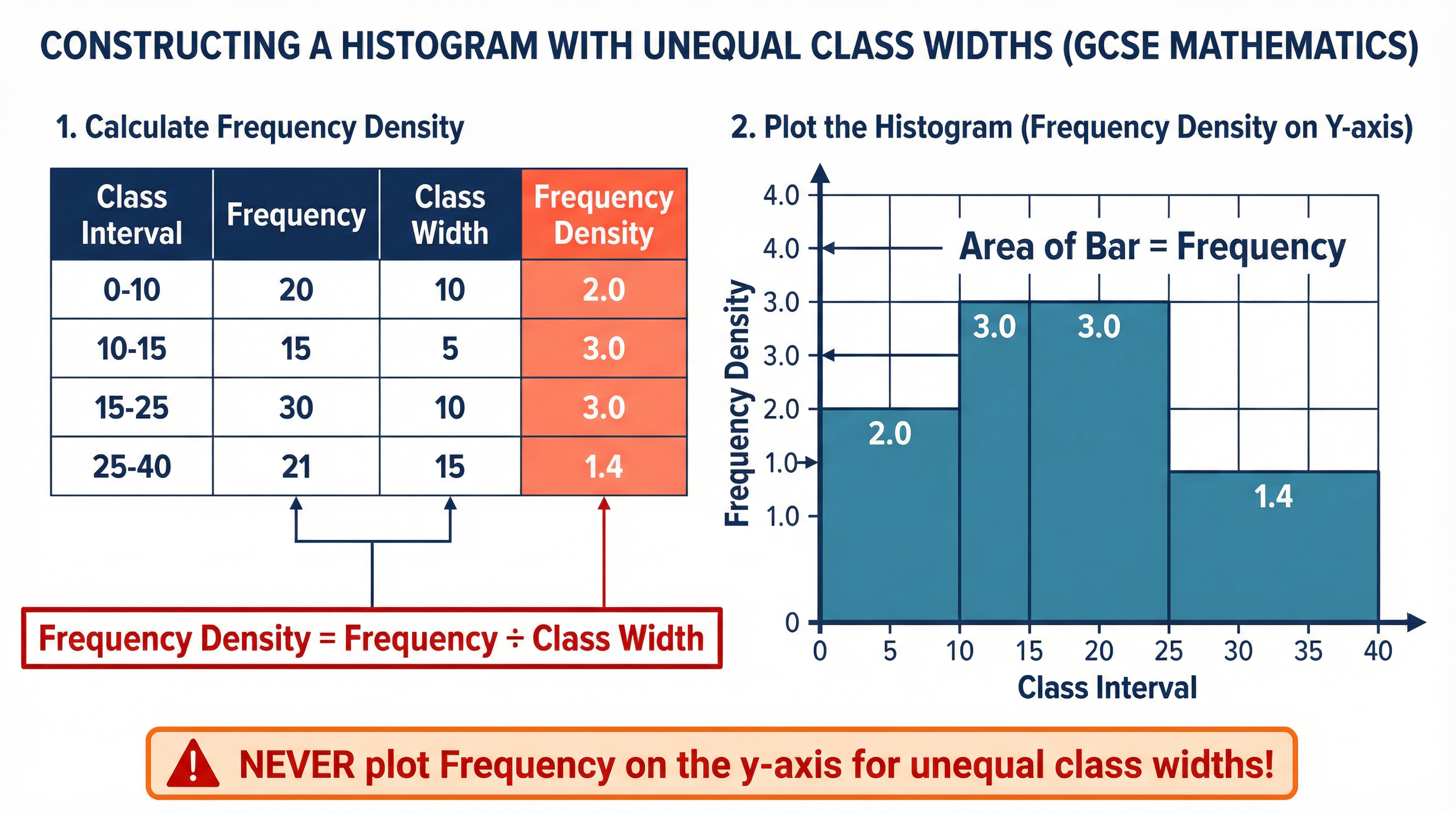
- Histograms with Unequal Class Widths: This is a major source of confusion, but it's simple if you remember the golden rule: the area of the bar represents the frequency. The y-axis is never frequency; it is always Frequency Density. You must calculate this for each class interval before you start plotting.
-
Cumulative Frequency Diagrams: These show a 'running total' of the frequencies. The key is to plot the cumulative frequency against the upper bound of each class interval. The resulting 'S'-shaped curve (ogive) is a powerful tool for estimating the median (at the n/2 value), the lower quartile (at the n/4 value), and the upper quartile (at the 3n/4 value).
-
Box and Whisker Plots (Box Plots): A box plot provides a visual summary of five key statistics: the minimum value, the lower quartile (Q1), the median (Q2), the upper quartile (Q3), and the maximum value. They are excellent for comparing the distributions of two or more datasets side-by-side.
Mathematical/Scientific Relationships
Here are the essential formulas you must know. Pay close attention to which are given and which must be memorised.
| Formula | What it's for | Tier | Status |
|---|---|---|---|
| Mean = Σx / n | Mean of a simple list of data | Both | Must memorise |
| Estimated Mean = Σfx / Σf | Mean from a grouped frequency table | Both | Must memorise |
| Pie Chart Angle = (f / Σf) × 360° | Calculating the angle for a sector | Both | Must memorise |
| Frequency Density = Frequency / Class Width | The y-axis value for a histogram | Higher | Must memorise |
| Frequency = FD × Class Width | Finding frequency from a histogram bar | Higher | Must memorise |
| Interquartile Range (IQR) = Q3 - Q1 | A measure of spread | Higher | Must memorise |
Practical Applications
Data handling isn't just for the exam hall. It's used everywhere:
- Business: Companies use sales data (histograms, time series) to forecast future revenue and manage stock.
- Science: Biologists use scatter graphs to see if there's a correlation between two variables, like sunlight and plant growth.
- Government: The Office for National Statistics uses sampling and estimation to produce reports on the UK's population and economy.
- Healthcare: Cumulative frequency graphs can be used to track patient recovery times, while box plots can compare the effectiveness of different treatments across patient groups.