Study Notes
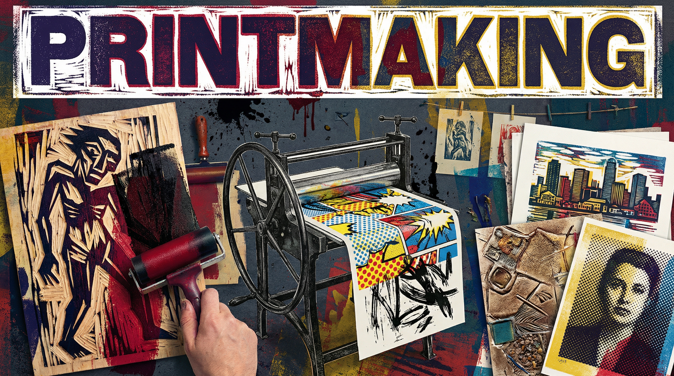
Overview
Printmaking, within the context of OCR GCSE Art and Design, is a dynamic and versatile discipline that moves far beyond simple reproduction. It is a creative language of mark-making, layering, and texture. Candidates are expected to explore one or more printmaking methods — such as relief, intaglio, or planographic printing — not just as a technical exercise, but as a means of developing and expressing personal ideas. A successful project will demonstrate a journey from initial research and inspiration (AO1), through rigorous material and process experimentation (AO2), to detailed recording and reflection (AO3), culminating in a resolved and meaningful final outcome (AO4). The examiner is looking for your ability to think like a printmaker: to understand the unique qualities of your chosen process and exploit them to create compelling visual work.
Key Knowledge & Theory
Core Concepts
To achieve highly, candidates must grasp the fundamental principles that underpin all printmaking. This involves understanding the distinct characteristics of the three main families of printmaking. A deep understanding allows you to make informed choices about which process is most appropriate for your creative intentions.
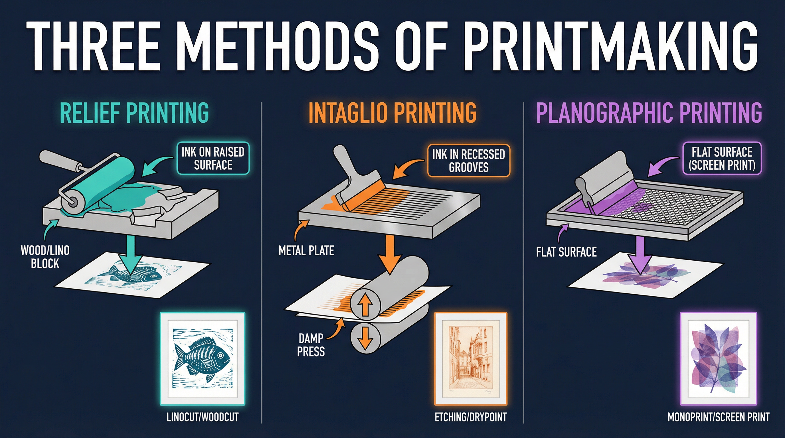
- Relief Printing: This is an additive process where ink is applied to the raised surfaces of a matrix (like a lino or wood block). The areas that are cut away do not print. This method is excellent for creating bold, graphic images with high contrast. The character of the marks made by the cutting tools (gouges) is a key part of the visual language.
- Intaglio Printing: This is a subtractive process. The image is incised or etched into a plate (usually metal), and ink is forced into these recessed lines and grooves. The surface is wiped clean, and when damp paper is pressed against the plate with high pressure, the ink is pulled out of the lines. This method is capable of producing incredibly fine, detailed lines and rich tonal areas (aquatint).
- Planographic Printing: This method uses a flat surface (or plane). The image is created by making parts of the surface ink-receptive and other parts ink-repellent. Screen printing (using a stencil on a mesh screen) and monoprinting (drawing directly onto a flat plate to create a unique, one-off print) are key examples. This process is ideal for working with bold shapes, flat areas of colour, and photographic imagery.
Key Practitioners/Artists/Composers
Engaging with the work of other artists (AO1) is not about copying; it's about learning their visual language and using it to inform your own. Your analysis must go beyond biography and focus on technique, process, and concept.
| Name | Period/Style | Key Works | Relevance |
|---|---|---|---|
| Ernst Ludwig Kirchner | German Expressionism (Die Brücke) | Street, Berlin (1913), The Bathers (1909) | Kirchner's woodcuts are a masterclass in expressive mark-making. Analyse his use of coarse, angular gouges to create a sense of raw emotion and urban anxiety. Credit is given for linking his cutting style to your own experimental marks. |
| Andy Warhol | Pop Art | Marilyn Diptych (1962), Campbell's Soup Cans (1962) | Warhol exploited the mechanical, repetitive nature of screen printing to comment on consumer culture. Look at his use of flat colour, deliberate misregistration, and serial imagery. Essential for any screen printing project. |
| Katsushika Hokusai | Ukiyo-e (Edo Period Japan) | The Great Wave off Kanagawa (c. 1831) | A master of the multi-block colour woodcut. Analyse his precise registration, graduated colour (bokashi), and dynamic compositions. His work shows how relief printing can achieve incredible subtlety and complexity. |
| Kara Walker | Contemporary | Gone: An Historical Romance... (1994) | Walker uses large-scale black cut-paper silhouettes and printmaking to confront racial stereotypes and American history. Her work is a powerful example of how a simple technique can be used to explore complex, challenging themes. |
Technical Vocabulary
Using specialist terminology accurately is critical for high marks in your annotations (AO3) and any written exam component. It demonstrates to the examiner that you have a secure technical understanding.
- Matrix: The surface onto which the image is created (e.g., lino block, metal plate, screen).
- Edition: A set of identical prints made from the same matrix. They are usually numbered, e.g., 3/20 means the third print in an edition of twenty.
- Registration: The method of aligning the paper and matrix to ensure that multiple layers of colour print in the correct position.
- Brayer: A small, hand-held roller used to apply ink to the matrix in relief printing.
- Gouge: A cutting tool, often with a U-shaped or V-shaped blade, used to carve into a lino or wood block.
- Burr: The rough ridge of metal raised on either side of a line incised with a drypoint needle. It holds ink and creates a characteristic soft, velvety line.
- Aquatint: An intaglio technique used to create tonal areas. Powdered rosin is fused to the plate, which is then etched to create a pitted surface that holds ink.
- Reduction Printing: A relief printing method where a multi-colour print is created from a single block. The artist prints the first colour, then carves away more of the block and prints the next colour on top, and so on. This is a high-skill process as the block is destroyed during the process.
Practical Skills
Techniques & Processes
Your portfolio must evidence your ability to handle printmaking processes with increasing control and confidence. Focus on mastering one process rather than attempting all of them superficially.
Developing a Relief Print (Linocut): A Step-by-Step Guide
- Design Transfer: Finalise your design on paper. Trace it and transfer it onto the lino block using carbon paper. Remember the final print will be a mirror image of your design on the block.
- Cutting the Block: Secure the block. Begin cutting away the areas you want to remain white (negative space). Use a V-gouge for fine lines and a U-gouge for clearing larger areas. Vary the direction and depth of your cuts to create texture and tone.
- Inking the Block: Squeeze a small amount of block printing ink onto a flat, non-porous surface (like a sheet of glass). Use a brayer to roll the ink out into a thin, even layer. You are looking for a suede-like texture and sound.
- Applying Ink: Roll the inked brayer over your block. Ensure all raised surfaces are covered evenly. Avoid getting ink into the cut-away areas.
- Taking a Print: Carefully place your paper onto the inked block. For accurate registration, create a registration jig from cardboard. Burnish (rub) the back of the paper firmly and evenly with a clean roller, a baren, or the back of a spoon.
- Pulling the Print: Gently peel the paper back from one corner to reveal your print.
- Refining and Editioning: Examine your first print (a 'proof'). Decide if you need to cut more from the block. Once you are happy, you can produce your edition, ensuring you re-ink the block for each print.
Materials & Equipment
Understanding your materials is crucial for AO2. Your annotations should explain why you chose specific materials.
- Paper: The choice of paper significantly impacts the final print. Smooth, lightweight Japanese papers are excellent for hand-burnishing relief prints. Heavier, absorbent papers like cartridge or Fabriano are better for intaglio as they need to be dampened. Experiment with different paper weights, textures, and colours.
- Inks: Inks vary in viscosity (thickness) and drying time. Water-based inks are easy to clean but can dry quickly. Oil-based inks offer richer colours and longer working times but require solvents for clean-up. Experiment with mixing colours and modifying ink with extenders or retarders.
- Safety: Always cut away from your body. Use a bench hook to secure your lino block while cutting. When using etching acids or solvents, ensure you are in a well-ventilated area and wearing appropriate personal protective equipment (PPE) like gloves and goggles.
Portfolio/Coursework Guidance
Assessment Criteria
Your entire project is assessed against the four AOs. They are weighted equally at 25% each. You must provide evidence for all four.
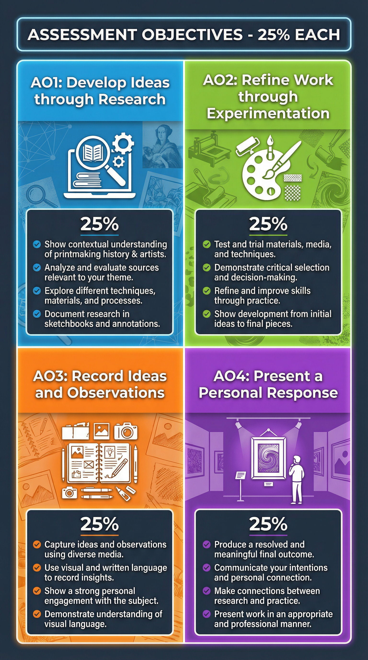
- AO1: Develop: Show you have looked at the work of other printmakers and used their techniques and ideas to inspire your own. This is evidenced through sketchbook pages with analytical annotations and artist studies.
- AO2: Refine: This is the journey of experimentation. Examiners want to see your test prints, your mistakes, and your refinements. Annotate everything to explain your thinking process.
- AO3: Record: Document your creative process. This includes drawings, photographs of your process, and detailed notes explaining your technical decisions. It's about showing your thinking.
- AO4: Present: This is your final piece or series of prints. It should be a confident, personal, and meaningful response that successfully resolves the ideas you developed in AO1 and refined in AO2.
Building a Strong Portfolio
Your portfolio or sketchbook is a visual diary of your thinking and making process. It should tell the story of your project from start to finish.
- Don't Hide 'Failures': A smudged print, a mis-registered layer, or a poorly inked block are all valuable learning experiences. Mount them in your sketchbook and annotate them, explaining what went wrong and what you did next to solve the problem. This is excellent evidence for AO2.
- Annotate with Purpose: Your annotations should be a commentary, not a description. Don't just say 'I used red ink.' Say 'I chose a crimson red ink to create a visual link to the emotional intensity in Kirchner's work, and I applied it with a hard roller to create a flat, solid colour field that contrasts with the textured black layer.'
- Show the Process: Use photographs to document stages of your process that can't be stuck in a book, like inking a plate or using a printing press. This is vital evidence for AO3.
Exam Component
Written Exam Knowledge
While GCSE Art is predominantly coursework-based, your understanding of theory is tested through your annotations and the coherence of your project. Some specifications may have a written exam component where you will be asked to analyse artworks and explain processes. You must be prepared to:
- Analyse unseen artworks using specialist vocabulary.
- Compare and contrast the work of different artists, including printmakers.
- Explain printmaking techniques and processes clearly and accurately.
Practical Exam Preparation
For the Externally Set Assignment (ESA), you will be given a theme or starting point and a set period of preparation time before a timed practical exam (usually 10 hours).
- Use the Prep Time Wisely: This is where you do all your AO1, AO2, and AO3 work. Develop your ideas, research artists, experiment with printmaking techniques, and plan your final piece thoroughly.
- Plan for the Timed Element: Your 10-hour exam is purely for AO4 - creating the final outcome. You should go into the exam with your lino block already fully cut or your screens prepared. The time is for printing, not for designing.
- Be Ambitious but Realistic: Plan a final piece that is achievable within the 10 hours. A complex multi-block reduction print might be too risky. A well-executed two-layer linocut or a series of monoprints could be more manageable and just as effective.